Stand Graphics: Message Hierarchy
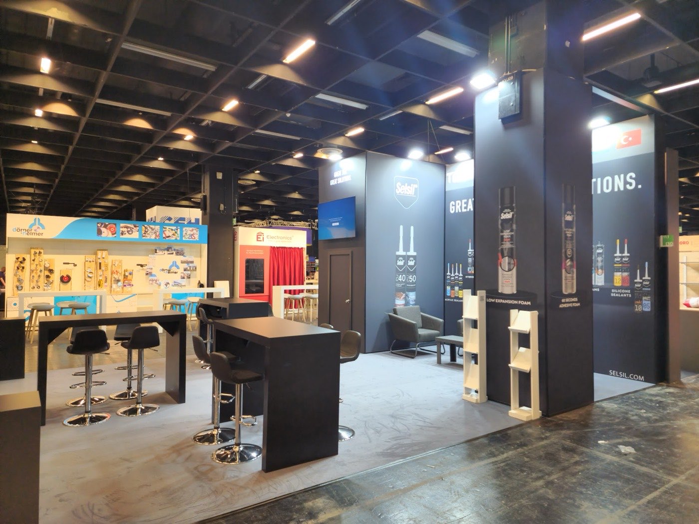
A passing visitor reads a stand in seconds and from three distances — and decides from those readings whether to stop. Effective stand graphics are not decoration; they are a message hierarchy engineered for those three readings.
The three-distance rule
- Far — the end of the aisle: brand name and a one-word category. Large type, high contrast, mounted high
- Middle — a few stands away: the value proposition in one jargon-free sentence: what is in it for the visitor
- Near — at the stand: product information, specifications, the story — for those who chose to come close
The classic failure moves near-distance content onto far-distance surfaces: paragraphs nobody can read from the aisle, generating visual noise instead of a message.
Text discipline
Stand graphics are scanned, not read. Headlines short, concrete and specific to you — "your solution partner" fits every company and therefore describes none. Say what you make, what problem it solves, which sector it serves. Prove it with real product and site photography; stock imagery reads as stock at twenty paces.
Language decisions
Choose by the fair's visitor profile: at international fairs English leads, with the local language as a second tier where it earns its place. Keep the hierarchy — two languages at equal size halve each other's legibility. Push multilingual depth into QR-linked documents rather than onto walls.
Consistency and the tests
One identity across all facades: colours, typography and logo placement consistent, with the logo visible from every open side. Then two desk tests before approval. The three-second test: project the design at real proportion, glance, and ask what actually registers — name, business, promise; if not, rebuild the hierarchy. The distance test: judge a shrunk version for the far reading, the full-size detail for the near one. Both tests catch on site problems while they are still free to fix.
Production checks
- Print resolution matched to viewing distance — near surfaces need the pixels
- Proof prints for colour-critical surfaces, brand colours above all
- Panel seams mapped so they never cut through a headline or a logo
- Graphic measurements reconciled with construction drawings to the millimetre
- Lighting reviewed with graphic positions — an unlit message is switched off
Choose production technique by surface and lifespan: fabric tension systems for large seamless walls, panel prints for durability across reuses. Design the graphics program in two layers — a constant identity layer and swappable message surfaces in standardised sizes — and route final approval through one owner, with the printed version flagged in the archive. That structure is what lets next fair's stand look new for the cost of a re-skin.
Approval and version discipline
Route graphics through one approval owner: content accuracy verified by the relevant teams, final visual sign-off concentrated in a single pair of hands. Approval by committee pushes change requests past the print deadline, where they become either costs or regrets. Archive with version numbers and flag the printed version explicitly — "which file did we actually print" should be a lookup, not an investigation. Design the update strategy into the system itself: identity surfaces that persist across fairs, message surfaces in standardised sizes that swap per fair. That split is what makes each fair's stand look current for the price of a re-skin rather than a reprint.
For end-to-end support with your exhibition stand or corporate event — from design to on-site delivery — get in touch, or see our recent projects.